Happy Friday friends! It was a short week but man do long holiday weekends throw me off. I was a day behind every day. So needless to say I am ready for the weekend and for a reset!
Speaking of resets….our kitchen renovation is well underway and I figured I would share the process with you and not just the finished product at the end. This way you can follow along with the transformation and feel like you were part of it. Now, is there a way you can also be part of the dust and mess it’s created? I need someone else to feel my pain. Listen, I certainly did not expect a dust free renovation but you guys, the dust is out of control! I feel like I’ll be dusting and vacuuming for years after this. And this isn’t even a full gut job! This is just some cabinet refacing, new back splash, and new counter tops haha. But we did cut down a wall, soooo yea. Sawing down drywall = dust.
So today I figured I would just take you through the start of the process and give you a run down of what we are going to be doing and what areas we still haven’t yet decided on.

A little background…our house is over 13 years old. Not too old but just old enough now to where things are starting to get outdated. We love this home. It has everything we need and we adore our neighborhood and the area we live. But it just needs some new love and attention because what was in when we moved in is not in anymore.
As you see in the picture the kitchen is definitely fine. It’s fully functional and there isn’t technically anything wrong with it, but I’m a light and bright kind of girl so the orange/tan cabinets and black counter tops just aren’t cutting it anymore. I want white, crisp, and airy! Here’s some Pinterest inspiration of what we are going for.

Aside from the cute back splash design above the stove, this is what we are aiming for. Our Cabinets are staggered the way these are so this is a good representation. We are doing the white, glossy subway tile back splash like in this picture and we are doing quartz counter tops that look marbled, similar to this but with less gray veining. And obviously our layout is different, but this is the general theme.
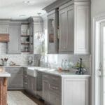
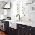
Now listen, I am all about kitchens with dark cabinets and those styles that are just so in right now, like these…..
I’m obsessed with these looks! And truthfully if I was a celebrity with multiple homes I would do this (probably the navy cabinets on the right) in a heartbeat because when it goes out of style I could just live in one of my other celebrity mega mansions while it gets redone. But, since I am just a normal, regular human who has to think more practically, I wanted something timeless. Something that we really aren’t going to have to renovate again for years to come. I’m okay with having to change up light fixtures and hardware but I don’t want a kitchen that’s off trend 5 years later. So the classic white kitchen, it is.
So a couple things we are switching up…..first up cabinets.

I never knew there were so many options for cabinets. I knew I wanted shaker style but I didn’t know there were flat shaker, sort of raised shaker, ones that sit inside the door, one that sits outside the door, and so on. I love that there’s so many options but sometimes you almost want no options so you don’t have to make a decision. Is that anyone else? I did know that I wanted shaker with a little style because sometimes shaker cabinets can look really flat and boring. So we settled on a style that has a couple layers to it so it looks less flat. Is this making any sense? It’s easier to explain in person. But basically here’s what I knew I wanted…..see how with our current cabinet the center of the doors pops out?

Well we essentially wanted to chop that off to have a more flat style like this…

So see how it’s more inverted? Ugh, I really need to learn more technical terms. So that’s change number one. Now luckily our cabinets are in good shape so we are just refacing the doors. From there we need to pick out hardware. I love the handlebar look on drawers and doors like in the above picture so we will likely go with a version of that. We were thinking of doing gold but the more I think about it, I just don’t know if that’s going to work with all the stainless we have (appliances, sink, faucet) and the grey marbling in the counter tops. So while I love the gold look, I’m thinking silver might be our best bet.
We also need new light fixtures and since we have likely ruled out gold, we will probably either go with black or silver, and I’m thinking a design like this….

So jury is still out on hardware but that’s how I’m leaning currently.
Our biggest change is really cutting down this bar top counter top.

As you can see in the picture it was two levels. Instead we have removed that top layer and the counter top is going to be all one level and just one big slab. We will still have stools on the other side but now they will just be lower. It’s crazy how getting rid of that top layer has really opened up the space. It’s a change I’m excited about.

Another big change we are doing is getting rid of the lattice wine rack (pictured earlier above) and putting in a new middle cabinet with glass doors that will be similar to this….

Our outward design is similar to this and but we are skipping the in cabinet lighting because I didn’t want glass shelves and without glass shelving for the light to shine down through, you have to do rope lighting around the inside of the door and we didn’t want that. And while I love the look of in cabinet lighting, we wondered how often we would really use it. So we opted for no in cabinet lighting, but will do under cabinet lighting the whole way around.
Our last biggest decision was our sink. Who would have thought there would be so many options for sinks! We knew we wanted stainless steel, and I used to think I wanted a farm sink but Jen, our project manager, pointed out that sometimes you splash more water out of the sink with the farm sinks since they hang over the outside of the counter top. So we opted to do a sink that sits inside the counter top.
Then it was, do we want a 100% sink (all one big sink), 50/50, 80/20, or 60/40. I mean, what? I thought a sink was a sink haha. I definitely thought I wanted 100% because I love the look of it but then I thought about how many times I fill a sink with dish water and then discover a dish that needs rinsed off before going in the water, so I quickly realized that would start to annoy me after a while that I couldn’t rinse once soapy water was in there. Then I considered 80/20 but found the 20% side tends to be shallow and kind of pointless, so I settled on 60/40, thinking that the 60% could be good for big pans or cookie sheets.
Alright friends, that’s the gist of the changes. I plan to do another update before the finished product but if there aren’t major changes I’ll save it for the final post. But stay tuned to see the progress and finished product! Have you done a kitchen renovation? If so comment with your take away’s and any do’s or don’ts you found along the way.
See you back here Monday friends! Have a great weekend.
Jill


